|
|
| CHARACTERISTICS AND FORMS OF THE URBAN CLIMATE |  |
| | | |
 2.11 Climate Change 2.11 Climate Change |
During the last 100 years, the global temperature has increased and this by 0.74 kelvin (K) since the beginning of the 20th century. The Intergovernmental Panel on Climate Change (IPCC) sees the reason for the increase with a very high probability (of more than 90 %) in man-made influences.
The main reason for this development is our use of fossil fuels with an emission of about 32 billions of tons of CO2 worldwide (2010) (Source: Climate Service Center, Geesthacht), rising trend continues (by about 2.5 % every year).
Especially since 1950, the temperature curve has risen sharply. Most probably, the average temperatures in the northern hemisphere have been higher than in any other period of fifty years during the last 500 years. They probably exceed the values of even the last 1,300 years or even longer. Mountain glaciers and snow layers are receding worldwide and the sea level rose by an average of 17 centimetres during the 20th century.
If we continue to emit greenhouse gases at that rate into the atmosphere, scientists expect a temperature increase of 1.8 to 4.0 K until the end of the century – some experts even consider 6.4 K as possible.
The regions with the highest increase will probably be the mainland and the polar regions. The arctic ice will continue to melt. Some models even expect its almost total disappearance during the summers in the second half of our century. This could lead among others to an increase of the sea level of 18 to 59 centimetres until the year 2100.
What will most probably also change are the intensity and distribution of precipitation: While humidity will rise in higher latitudes, it will diminish in most subtropical regions. This would mean that the current trend continues.
Climate models also predict that heat waves, local heavy rainfalls and hurricanes could be more frequent and even more intense. Figure 2/25Figure 2/25 shows the development of the temperatures from 1850 to 2005.
The linear trend since 1850 (black line) , since 1900 (the yellow line) and since 1950 (red line) is steeper. The trend curve (polynomial fit of the time series) shows the dramatic increase since the late seventies (black curve).
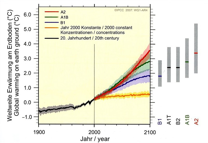
Figure 2/26 shows the warming of the earth"s surface – scenarios. If the greenhouse gas emissions have been frozen at the 2000 level , the orange line would have been expected . The gray bars on the right show the likely range of the temperature rise , as they forecast the six scenarios of the IPCC (IPCC 2007).
|
|
| | | |
 |
| Fig. 2/25: Development of average temperatures , Source: DWD | | |
 |
| Fig. 2/26: Global warming, scenarios, Source: BMU 2009 |
|
